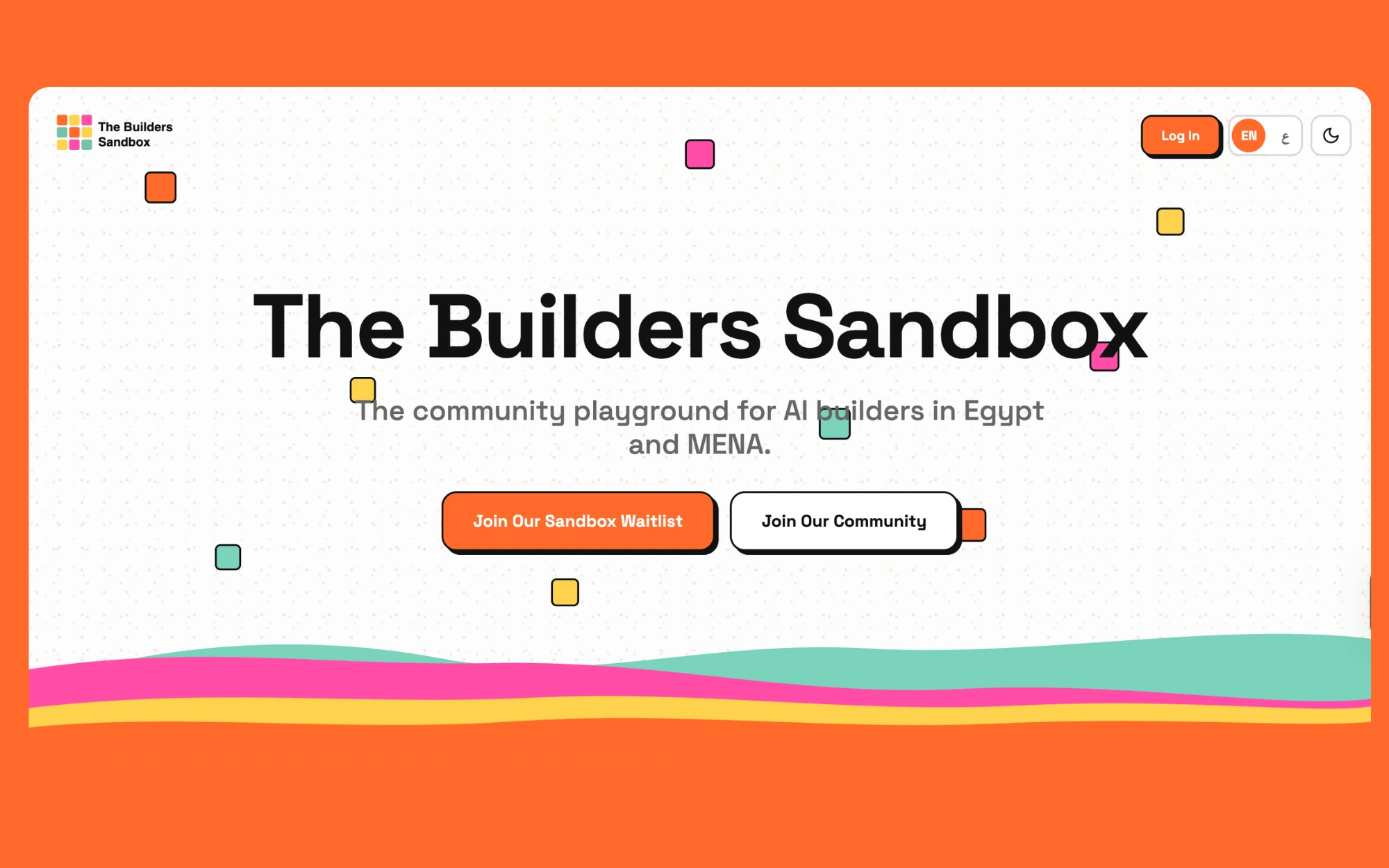
The client wanted a website that didn't just inform — it had to pull people in. We designed an interactive, motion-rich experience that turns visitors into participants: bold typography, terminal-inspired moments, and a community layer that puts builders front and center. The result is a site that feels alive, drives engagement, and reflects the cutting-edge work behind the brand.
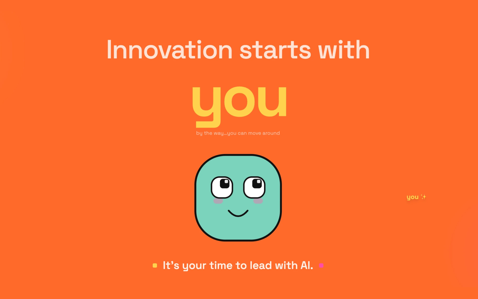
> Hero statementA bold opening moment that frames the visitor as the protagonist — setting the tone for an experience built around participation, not passive scrolling.
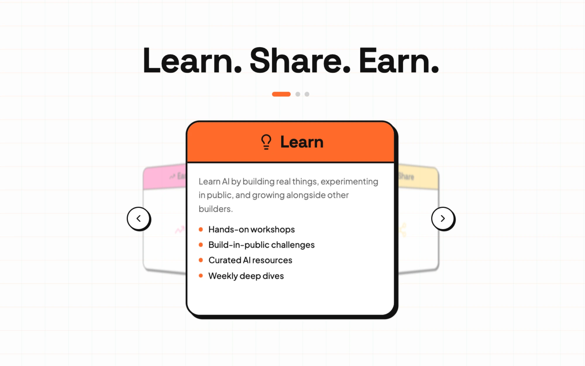
> Value loopA three-beat section that distills the community's core promise into a memorable rhythm — clear, scannable, and built to convert curious visitors into members.
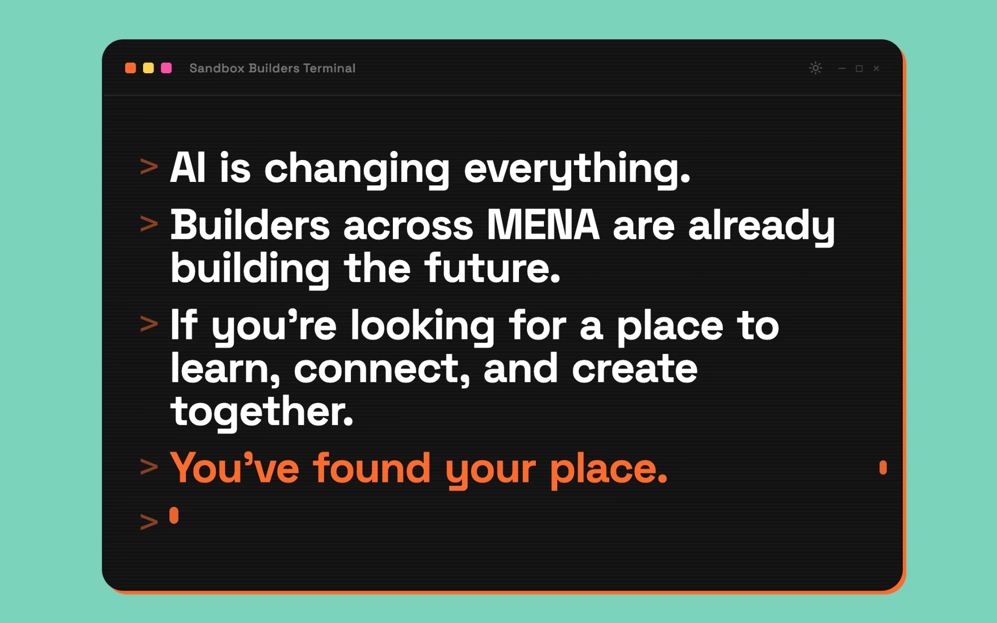
> Builders terminalAn interactive, terminal-inspired module that lets visitors explore the platform's tools in a tactile way — turning a product showcase into a hands-on demo.
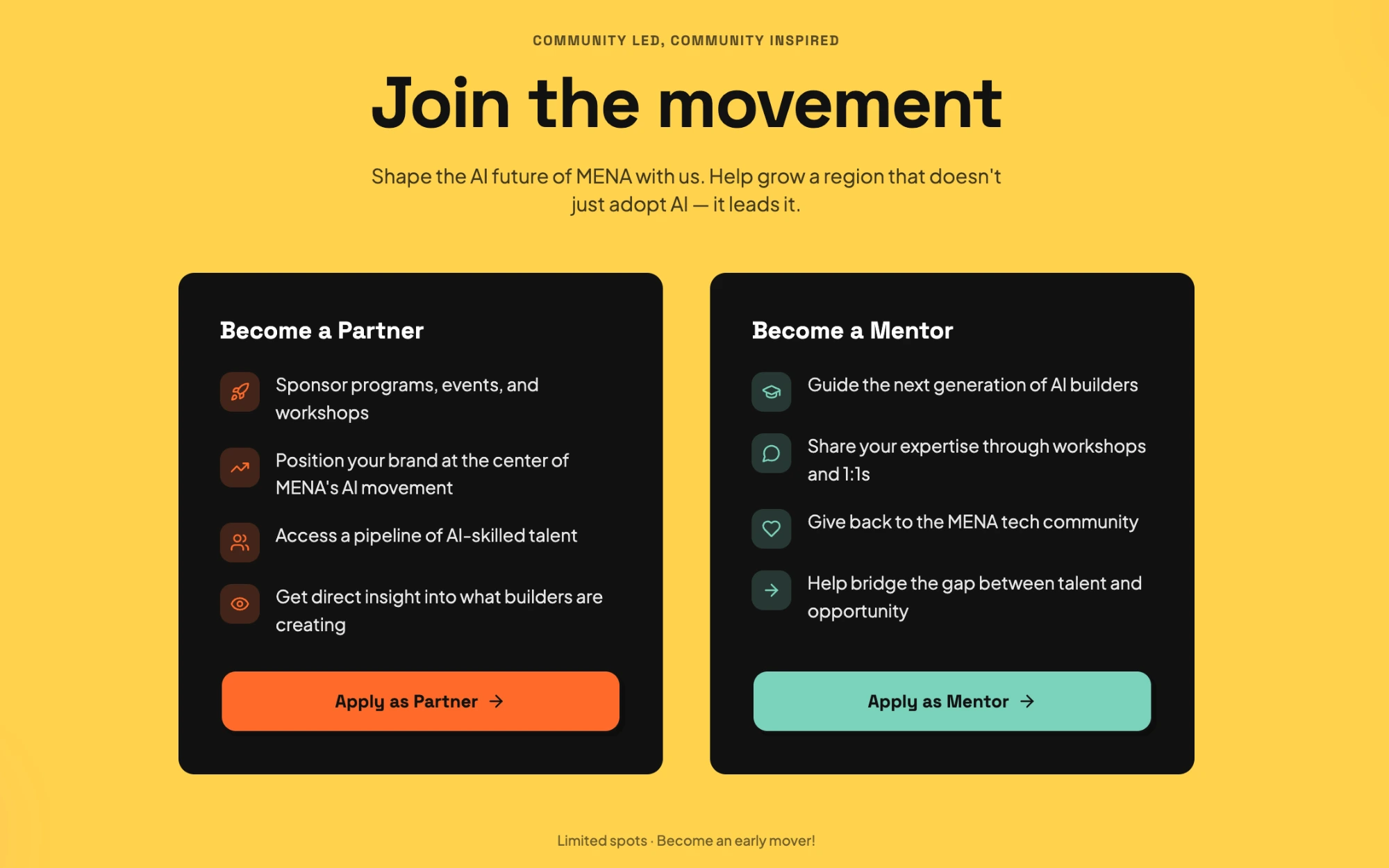
> Call to actionA high-contrast conversion moment designed to channel momentum from the page into sign-ups, with copy and motion that make joining feel like the natural next step.
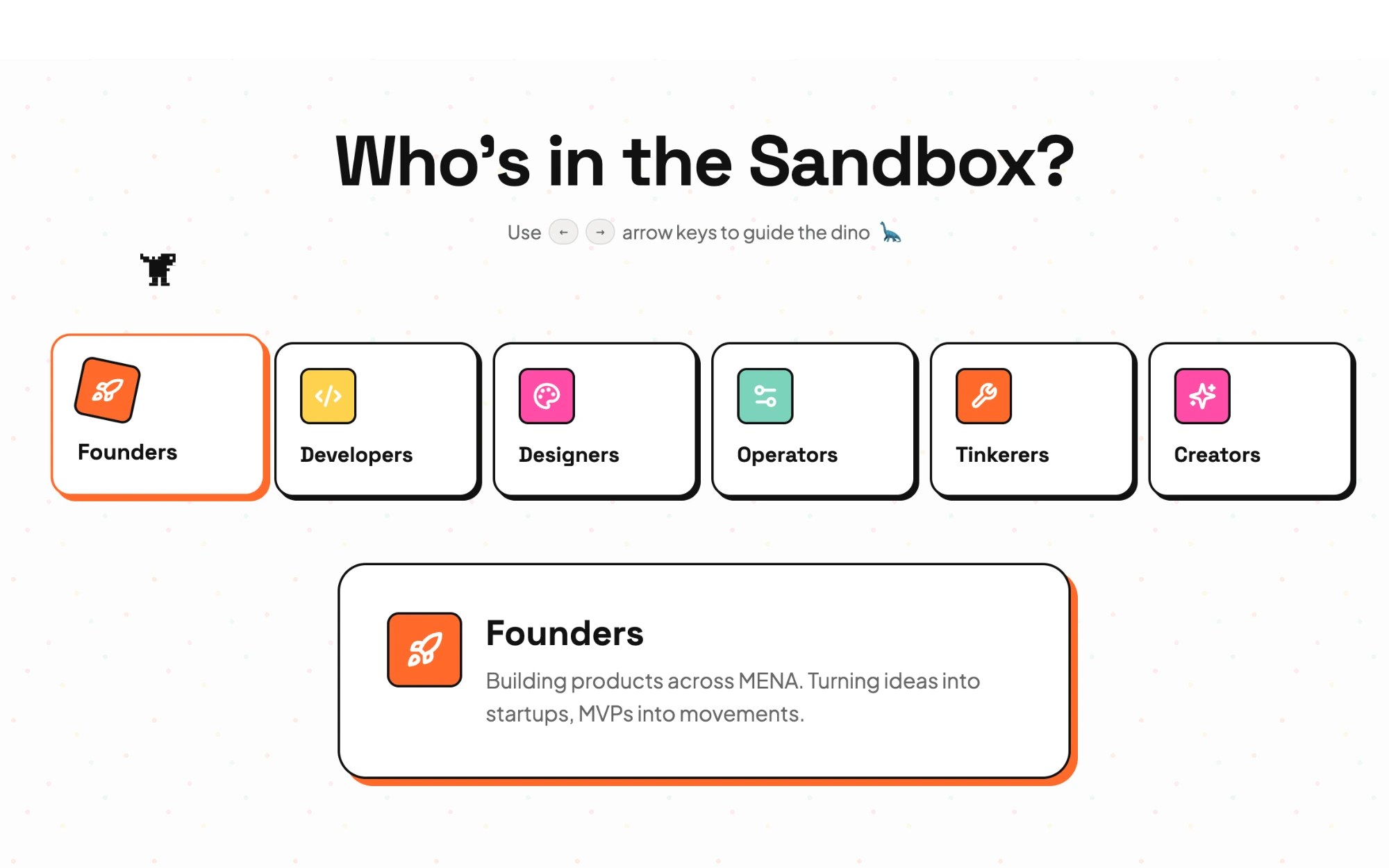
> Community wallA living grid of the people inside the Sandbox — putting real builders front and center as social proof and as an invitation to belong.